Thursday, June 28, 2012

Texture and color in the city


To change things up a bit I'm posting images from a photo safari I took with my daughter Indigo to an area just west of my neighborhood in Chicago, underneath the Metra train tracks.


I like how this graffiti artist worked with the structure of the staggered block wall.


I am particularly entranced by the layering of type and imagery that create such beautiful complex images when cropped.


It's this concept of layering imagery that I've been exploring for the last couple years with my painting.


 These ones were really pretty with metallic bronze paint.
A discarded metal tree sculpture added another point of interest.
Suddenly a train went over head.


Rusty Bits
The massive chandelier was another interesting addition to this urban space. It's probably about 8 feet across with silk flowers entwined around it.

There were a lot of these weird little stalactites.
Believe it or not this is the base of one of the support columns of the overhead track. Most of the column is not as deteriorated, but quite a few of the other columns also looked like this.


I love these colors. I see things like this and want to remember it for a color palette for painting.

I love this texture and all the beautiful reds.
What fun to come across this blue heart with my initial on it. 


I hope you find these images as inspiring as I do and see there can be artistic beauty hidden in plain site.

Monday, June 25, 2012

Coming soon! Extraordinary blog tour- Patchwork Sassaman Style

My good friend and designer extraordinaire Jane Sassaman has a beautiful new book! and a bunch of us are helping her celebrate.

During the month of July visit these blogs and leave a comment on the post about Janes book for a chance to win a copy of your own. (US only please)

July 2 Laura Wasilowski
July 3 Jessica Sloan
July 4 Happy 4th of July!
July 5 Judy Coates Perez
July 6 Jane Sassaman
July 7 Dragon Threads
July 8 Gloria Hansen
July 9 Melissa Peda
July 10 Susan Bruebaker Knapp
July 11 Jacquie Gering
July 12 Weeks Ringle
July 13 Sew Cal Gal
July 14 Jessica Kovach
July 15 Pam Matthews
July 16 Frieda Anderson
July 17 Pat Sloan
July 18 Jan Krentz
July 19 Make It Simpler
July 20 Lyric Kinard
July 22 Jane LaFazio
July 24 Nancy Zieman

Thursday, June 21, 2012

New Class! Alternatively Bound and Stitched

I'm really excited to tell you about my new class, Alternatively Bound and Stitched, that I will be teaching in Long Beach at International Quilt Festival, Thursday, July 26th.

The focus of this class is not only learning 3 alternative binding techniques that work great with art quilts but also developing strategies for free-motion quilting designs, making a quilt sandwich, discussing; batting, basting, threads and needles, transferring designs to fabric and marking quilts for stitching more complex designs.

Along with making quilted and bound samples in class, there will also be a powerpoint with examples of different ways to think about what kind of stitching motifs to use for quilting.

As I began writing the handout for the class last fall, I found that I had so much information that I wanted to include, that it became a 17 page ebook! that each student will get on a disk in class.

The ebook is a pdf and can be uploaded to a tablet and opened in either kindle, ibooks or other apps for reading pdfs.
I emailed myself the pdf and opened it on my ipad and it worked beautifully.

I have already been asked about selling the ebook, which I will probably do when I have a chance to figure out the best way to do it. Right now I have A LOT on my plate to deal with, so please bear with me. Hopefully in the fall after I've moved and resettled I can get to it. In the meantime come take my class! ;-)

Tuesday, June 19, 2012

Does color intimidate you?

Do you find yourself choosing the same 'tried and true' color combinations over and over? Do you want to consistently dye bright saturated colors and muted colors when you want to? Can you recognize the difference between warm and cool colors and understand why you would choose one over the other to mix exactly the color you want? 

Join me Friday, July 27 to learn the answers to these and many more questions about Color Theory in sunny Long Beach at International Quilt Festival.
Reading about color is valuable and arranging swatches of fabric into color combinations is helpful, but it doesn't show the different hues that make up a specific color and explain why one swatch combination will look so much better than another that is only slightly different
I believe the best way to really understand color is by mixing paint and witnessing what happens as the two colors interact. This is the process it takes to train your eye so choosing color ultimately becomes second nature.
This is a fun, relaxing and informative day, guaranteed to give you more confidence working with color.
I hope to see you in sunny Long beach!

Monday, June 18, 2012

Get Inked in Long Beach!


Wow! It's four weeks until International Quilt Festival, Long Beach. Would you like to immerse yourself in color by learning how to paint fabric with acrylic inks?

Saturday I'm teaching a fun new class 10 Techniques with Acrylic Inks.


Spend a day filled with fun and relaxed exploration, beginning with creating colorful textured backgrounds

exploring mark making with different kinds of stamps 


and drawing with inks using quill type calligraphy and ruling pens.


We'll explore layering imagery with color and marks


cutting masks with freezer paper.
And painting in a transparent watercolor style.
This class is going to packed with lots of tips and ideas of ways you can work with these versatile inks on fabric. I'd love to see you there!  
Click here to see student work from the first inks class.

To see two art quilts painted with acrylic inks check out these step by step blog posts about making 8 of Cups and Black and Bloom All Over.

Saturday, June 09, 2012

Tea bags revisited

My life is a in a bit of chaos right now and I havent been able to work on anything art related for a couple weeks, so I'm reposting a couple of older blog posts about using tea bags and paper on fabric to make mixed media art quilts.

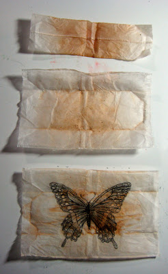
Drawing on a tea bag.

1. After steeping your tea, set tea bag on the counter to dry and enjoy that fabulous warm cuppa tea. Black tea has tannins which are what create those lovely brown stains.

2. When the tea bag is dry carefully remove the staple, unfold top of bag and shake out the dried tea leaves into the trash or compost bin.

3. Gently, pull seam apart down the length of the bag and fold out flat, brushing away any leaves that may be clinging to the paper. You can iron your tea bags if you want them nice and smooth before drawing.

4. Place the tea bag on top of a hand drawn design or lay it over a printed image. You should be able to faintly see the drawing through the tea bag. Trace your design onto the tea bag with a permanent ink marker, and fill in the details.

5. Now you can use this tea bag to collage onto paper or fabric using matte acrylic gel medium.

6. Using acrylic gel medium, paint the fabric where you will be putting the tea bag a tad larger than the size of the tea bag paper.

7. Press the tea bag onto the wet medium and brush more medium over the top of the tea bag sealing it to your fabric.

8. After the medium dries you can glaze over the drawing with layers of transparent paint, use colored pencils, or leave it as is in all its tea stained glory!

Making Illustrated Document No. 1


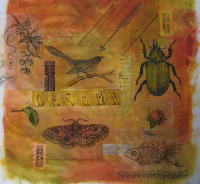
I painted a piece of fabric with yellow and ocher colors to use as a base. The drawings were done on tea bags. I drew on the bags with a fine tip permanent marker and used matte medium to collage them on the fabric. I also adhered a couple tags from the tea and those tags that come stapled to your dry cleaning. There is also some fabric ran through a xerox machine several years ago and a piece of a sewing pattern tissue.
I added text and marks for background patterns with rubber stamps inked with Tsukineko Inks. Then I fused the fabric to a 12 inch square of wool felt. I folded the edges over and fused them to the back of the felt. This makes a nice flat and flexible piece for stitching.
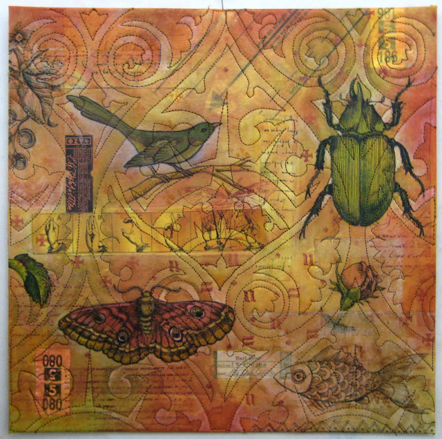
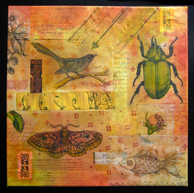
I was torn with how I should quilt this since the over all look began to feel like an aged document. I thought if I quilted around the elements like my first inclination would be, that it would be too predictable a thing to do, so I decided to take a risk and do quilting that was totally unrelated to the design of the piece but related to the aesthetic of the piece.

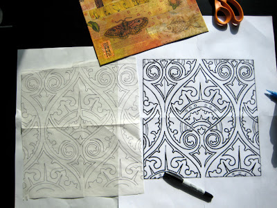
I found a gothic tile design that I modified into a pattern that could be stitched. After quilting the design I used a copper paint stick and shaded in some of the pattern. Then the bird and butterfly started to feel lost in the design so I pulled out some colored pencils and added a little color.

The total list of materials and techniques is:
white cotton fabric, teabags drawn on with permanent ink pen, tea labels, dry cleaning tags, sewing pattern, fabric with xeroxed imagery, textile paint, rubber stamps, Tsukineko inks, Shiva paint sticks, colored pencils, machine quilted on wool felt.

comments:
Anonymous said...
I love this piece of art....Wonderful imagery! I am amazed by your creative ideas and appreciate your willingness to share. Could you tell me how you transfered the tile design to the surface of the paper quilt? thank you so much....
Susan

judy coates perez said...
Susan,
I traced the design onto tracing paper. (seen in the small photo) I cut a few small holes in the paper away from stitching lines and used scotch tape to stick the paper to the quilt by placing tape over the holes. I stitched through the paper and the quilt and then tore it away when I was done.
Carol Sloan said...
Judy,
I was working on the paper quilt that I posted a pic of, and had drawn out my quilting design on regular tracing paper. I tried the design on a random quilt sandwich (to make sure it was a "do-able" design).I had a lot of problems with the stitches pulling up or out when I removed the tracing paper. I tried a small design with some paper specically made for sewing a quilting design and another with the kimwipes. The kimwipes did the best but I still had a small amount of pulling on the stitches. How did you do yours/did you have the same problem? I took pics so that I could post a "hey, look ...you really don't want to do this" posting...if you have a second to help, I'd sure appreciate it.
Thanks

judy coates perez said...
Carol,
I think my machine does a pretty tight stitch to begin with. The smaller the stitches, the more it is going to perforate the paper making it tear easier. There is a lighter weight tracing paper that comes on a roll, architects use it, and it will tear easier, also I am sure you realize now you to have to pull the paper away gently. Your thread tension may be a little loose as well, try tightening it and see if that helps.

Ricë said...
i love this--fabulous! how do the colored pencils work for you? i've tried everything to set them, to keep them from smearing on fabric. you've probably addressed this somewhere else already--

judy coates perez said...
Because the tea bags are paper the colored pencil stays on better than on fabric. I have never actually had a problem with them smearing, but you could try painting a light coat of fabric medium over them or give them a hit of artist spray fix. 

LinkWithin

Related Posts with Thumbnails