
 The 3 of Swords quilt I made for Beneath the Surface, was a departure from my usual style. My work although often inspired by life experiences is usually not so personal in nature, but the timing of that exhibit coinciding with some very difficult stuff happening in my life, provided me with an opportunity to work through some intense emotions.
I have decided my quilt for the next exhibit, The Space Between, will be a continuation of exploring my emotional state of mind a year later, by breaking away from my usual style again.
I love getting really focused and tightly rendering a representational image while painting, but I am also trying to get looser and more gestural with my painting, kind of like the direction I take with some of my mixed media work, but pushing it even further. Last summer I took a class with my super talented friend Alisa Burke in an effort to help loosen up and be more playful when painting, so I am using what I did there as a jumping off point for this new quilt.


I really liked how the colors would get soft and mottled if the fabric was very wet with ink

and if the fabric was dry, there would be visible brush strokes

After painting the fabric, I used a permanent marker to write personal words and phrases that expressed some of my feelings. These messages are being written for my own catharsis and ultimately will not be very legible to the viewer. My intention is for the words to be embedded in the work like a talisman.
I also collaged a few bits of printed imagery; a toner printed tea bag and some painted abaca paper that I had leftover from making my One collages.


I also used some of my hand carved stamps with the ink and it worked great, not as thick and gloppy as stamping with regular acrylics.

My next step was to draw/paint some big floral imagery. To draw the flower motifs, I thought I would try this solid stick permanent marker I ordered from Dharma.

It was kind of a creamy consistency, much like an oil pastel. It had a little bit of odor but as it dried (after a couple hours) the smell went away. It was easy to draw on the fabric and quickly work out a design. I used the whole stick to draw the images on the quilt, it was easy and convenient but did not go very far.

I am not sure it was better than using a paint brush and paint, but it was probably faster. If you are more comfortable drawing than painting a design freehand then I would recommend it.
To define the flowers from the background it was a matter of painting different colors of ink over the separate areas. For example I painted yellow over the blue areas of the leaves and blue over yellows to get an overall green. I painted a deeper blue over the areas that would be background, making it overall blue yet with all kinds of variations in hue because the colors underneath effect it in different ways.

The large flower was painted over with white, since there was so much green in the under painting it would have been difficult to put a warm color over it without getting a muddy dark flower. As I painted the flowers and background I ended up using white textile paint to add more details and painting over some of the drawn lines to make them bolder.

The next part of the design process involved creating a layer of thorny black weeds to paint on top of the floral imagery.
I took a photo of the painted fabric (by putting it on the floor and standing on a table) and printed out a copy on 8 1/2" x 11" paper. I placed tracing paper over the top and drew multiple versions of weeds until I had it the way I wanted and made a final clean copy with black marker.

My next problem was to figure out how to transfer my design to the painted fabric. I decided the best way to do it would be to project the image on to the cloth. Not having an overhead projector, I decided to use my digital projector that I use for giving lectures.
I scanned the tracing paper and opened the jpg in photosshop, connected my laptop to the projector, taped my painted cloth to the wall and lined up the projected line drawing over the painting. I used a fine point sharpie to trace the line drawing onto my painting.
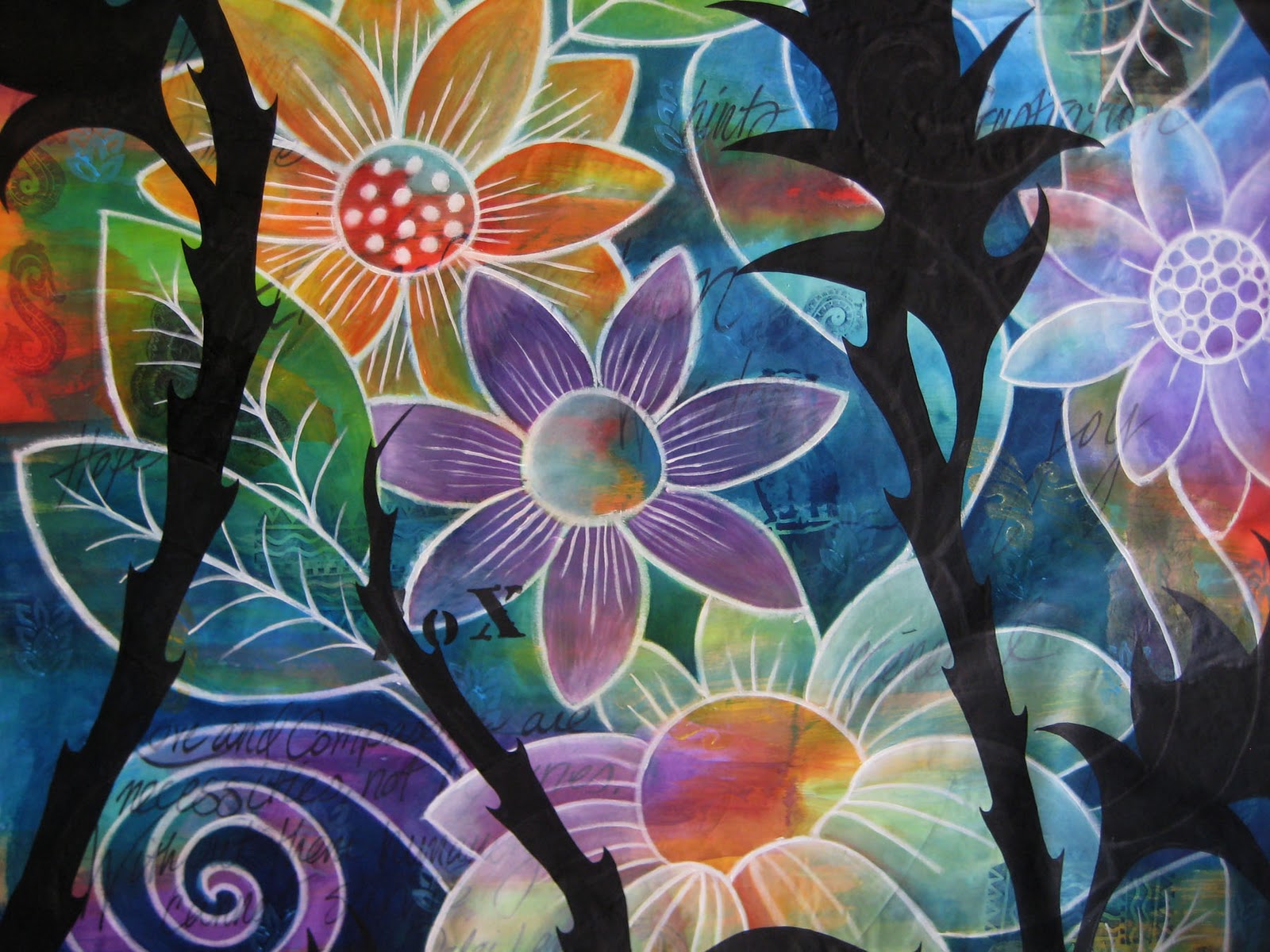
I painted the weeds with black textile paint, since I wanted it to have the most opacity and I knew it would be tough to cover the white lines.

So now you see where I am, one year after the Three of Swords quilt. There has been some difficult and ugly stuff (represented by thorny weeds) that I have had to deal with, but in the space between there has been a lot of growth, blossoming, renewal, light and life. Even the black bitterness has it's own beauty, it's just a little hard to see sometimes :-) So in other words, I am good! and life is certainly interesting, lol.
As I get further along in the process, I will post about the quilting.
Tweet
This is gorgeous! I love how you've shown this developing, and shared your thoughts about its creation. I guess we sometimes need to have the thorns to realize the beauty that exists between them.
ReplyDeleteWow, wow, wow! You have shown the beauty and complexity that can be created through layering. You have inspired me once again. I need to push myself a bit further and be braver with using MORE process... Thank you so much for sharing all of the yummy products you use -I'm going to the art store today!! xo
ReplyDelete@Suztats Exactly!!!! thanks
ReplyDelete@Cindy glad to get your day going with a fun excursion for more supplies! I'm looking forward to seeing what you do with them.
What an exciting post!!! I loved watching every amazing step. How I would love to take a workshop you!!!
ReplyDeleteI am in love with all the gorgeous colors on your post today. Makes a dreary Oregon day, better.
ReplyDeleteLife gives us lots of fodder, and I appreciate how you expressed it in that piece; thank you for sharing your art (life), thorns and all! I look forward to trying those fabulous inks!
ReplyDeleteWhat a gift to see such beautiful ideas & talent shared so freely. Thank you!
ReplyDeletethank you so much for sharing your work.....like Debi said, it is a true gift to us that you share your talent.God bless you.
ReplyDeletethis made me cry today. i totally get it, both the technical applications but everything behind it. thanks for always sharing your beautiful work and methods.
ReplyDeleteBeautiful. I hope I get to see it hanging in person.
ReplyDeleteJudy this made my day, I hope you are staying warm, Working on My photography, hope to see Dave and Nacy later this month. RJ
ReplyDeleteWOW! As I kept scrolling down I kept thinking it was done and then pow, another layer added along with more meaning. Thanks for sharing. Justine
ReplyDeleteJudy you are so good at explaining your process! I have watched you blossom this last year and it sure shows in this latest work. Bravo!
ReplyDeleteI went with half of your suggestion to get inks...I ordered a less expensive set of colors of a different brand, to try them out since I am not as good with a brush as you. Not. At. All.
Judy how much of the ink did you use on that much fabric? Did it stay pretty much on the surface of the fabric or soak into it?
ReplyDeleteI really appreciate your taking all those pictures to take us through the development process.
Wonderful!
Beautiful new direction for you, Judy! I can't wait to see the next step. You have the true artist's soul -- the ability to make something incredible from pain.
ReplyDeleteJudy, as always, your work is gorgeous. Thank you for not only sharing your process and technique, but showing that we can work through difficult times with art. You are such an inspiration. Heartfelt thanks.
ReplyDeleteWOW, WOW, WOW!
ReplyDeleteI think that's all I can say right now.
Judy, what a beautiful piece - thank you for sharing with us!
ReplyDeleteJudy -- when you say cotton sheeting, is it PFD fabric? And only you would experiment on a 4 foot by 5 foot piece -- brave!
ReplyDeleteYour results are beautiful. You are making the most brilliantly creative use of your recent life experiences!
This is so beautiful and I love how you showed how you get the different layers and your thought process as you go along.
ReplyDeleteJudy - I love watching your process and appreciate your sharing and your process. I was just wondering myself about how to mark the top of the quilt and love the scanning and projector idea. Thank You!
ReplyDeleteLaura T
@Bette I used a surprisingly small amount of ink, about 1/4 of a bottle of the prussian blue and purple and 1/3 of a bottle of process yellow. The amount used from the other colors isn't even noticeable.
ReplyDeleteThe ink did not saturate the fabric like dye would, it soaked in about as much as any other paint, it definitely bonded well with the fabric.
@Luanne, yes it was PFD cotton sheeting, I buy it by the bolt and get it 60" wide. It's pretty inexpensive so I don't think too much about experimenting on such a big piece.
ReplyDeleteFABULOUS! not only is this beautiful and informative, and personal, but I love the way you used the influence from Alisa and totally made it your own. OMG, I love this piece and the statement behind it. hmmm. guess I'd better get started on mine...
ReplyDeletexoxo
OMG, this is amazing, I love it. Wow, I haven't even started!Beautiful colors, story, you have so much color in your life!
ReplyDeleteThank you for sharing--both your personal growth this past year and your art process.
ReplyDeleteI had an old friend contact me this week and I was trying to catch him up on what had happened in the nine years since I'd last seen him. I mentioned my divorce and remarriage. He said that he remembered I had been going through a rough patch. I started to think--how much of the last nine years have been "rough patches?" So much--but there has been good in between. We let life be so hard sometimes when we should all just focus on that in between.
Judy, thank you SO much for sharing your process with us. This is just beautiful! I picked up your DVD in Houston and haven't had time for it yet, but it's on my list for this year!
ReplyDeleteBeautiful Judy. This depth in your work is such a win win -- you get teh catharsis and we get the eye candy that holds our attention a bit longer. Brava!
ReplyDeleteThis is a gorgeous work in progress. I can't wait to see how you quilt it. I really love how you released your emotions through the words hidden in the beauty of the blossoms. The words make this a very poetic piece.
ReplyDeleteThis is so beautiful, Judy. Thank you for sharing your work in stages - it's so helpful to see the process. And most of all, thank you for sharing your struggles and transformation, as I'm sure so many can find comfort and inspiration from this. There are so many words of love, rebirth, renewal in this piece - I love it.
ReplyDeleteThank you for sharing the journey...this work and the article by Dawn are both very powerful...
ReplyDeleteit lets others know that creativity is so important to healing...
as always your work is vibrant and makes me think!
This piece is wonderful, and it was very interesting to follow your thought process, too.
ReplyDeleteYou have 2 blogs! How do you find time to manage these things? I know I know! Time management.
ReplyDeleteYour creations are beautiful!
Wow! This just blew me away! You did what I have always visualized but didn't know how to accomplish. Each step just amazed me. And projecting the weeds onto the fabric - inspired! At first I thought the weeds were going to spoil it, but reading your reasons for including them and seeing the depths they gave just left me breathless. Thank you so much for sharing the process and your reasons.
ReplyDeleteJudy - this piece is just beautiful - especially combined with the personal story. You are truly an inspiration to all. I, too, love the FW Inks on fabric!
ReplyDeleteHey! I love the photo you used to display the FW Ink. I'm posting a tutorial on my companies home page that includes a photo of FW Ink. I was wondering if you would be okay with me using your photo. If not, I completely understand.
ReplyDeleteYou have a very lovely blog here and I love how the FW Ink image turned out in the end. Very creative! :D
Thanks
Avianna (Avianna@Arda-Wigs.com)
Awesome designs! Very well made.
ReplyDeleteThanks a lot for sharing.
This is so beautiful....!....and the fact that you shared what went into it and on it (your personal story as well as materials used) just made it all the better. Thank you for sharing - I can't wait to see the finished quilt!
ReplyDeleteHi Stilin Studio, this is actually an old blog I dont keep up anymore, so the finished quilt with the rest of the process details is here on my new blog http://www.judycoatesperez.com/making-black-and-bloom-all-over/
Deleteanother quilt you may be interested in thats painted with the acrylic inks and talks about the emotional process as well as technical is the 8 of cups which you can find here
http://www.judycoatesperez.com/making-the-8-of-cups/
thanks for stopping by and leaving a comment :-)