Sunday, January 30, 2011

Take a walk on the wild side

I am so excited about getting booked to teach at Idyllwild Arts this July! I have seen blog posts by Lesley Riley and Jane LaFazio about teaching there and it looks like such an amazing place, not only for the beautiful facility, but also its incredible location. The town of Idyllwild is an art colony in the mountains above Palm Springs.

July 19-21,  I will be teaching a 3 day retreat called Art Quilts: Painting and Surface Design Techniques. I have always wanted to teach a workshop like this. The first day we will focus on color theory; learning how to mix colors, work with textile paints and choose color palettes to best express your unique vision. The next day we will focus on mastering fabric painting techniques; painting backgrounds, working with masks, blending gradations and glazing color. On our third day we will delve into mixed media techniques; incorporating paper imagery, transfers, colored pencils, paint sticks, tea bags and more. 


So tell me, what could be better than spending 3 days in a warm supportive atmosphere, amid a pine tree forest in the fresh mountain air? If this sounds fabulous to you too, sign up early and save up to 10% on the total cost of programs and housing.

I can feel the inspiration already, let's make some art together at Idyllwild Arts! Registration begins February 1st.

You can also request a catalog to be mailed to you by sending an email here.

Tuesday, January 25, 2011

Time for healing and support

I know my blog posts have been a little sporadic lately, I don't know about you, but it feels like there is a lot going on in my life right now. One of the things I have been preoccupied with is my friend Melly Testas health, I would love for all of you to keep her in your thoughts and prayers over the next few months as she goes through treatments for breast cancer. She is such a giving beautiful soul and I think giving back to her this way is the least we can do.


Now the latest Fiber Art for A Cause fundraiser One organized by Virginia Spiegal hits even closer to home for us fiber artists, with one of our nearest and dearest presently battling the disease herself.
Bluebird

It occurred to me, that the two mixed media fiber art pieces I made for the auction, now have so much more significance for me not only because my good friend Melly has cancer, but also because both of my collages have bird imagery on them and those of you who know Melly and are familiar with her work, know that she adores birds. This simple synchronicity warms my heart.

So please mark your calendar on Februry 16 to make a bid on a peice of artwork and contribute to this very worthy cause.

Wednesday, January 12, 2011

Painting my next quilt with FW inks

I have begun working on a new quilt for the next exhibit being curated by Leslie Tucker Jenison and Jamie Fingal to follow last years exhibit Beneath the Surface.

The 3 of Swords quilt I made for Beneath the Surface, was a departure from my usual style. My work although often inspired by life experiences is usually not so personal in nature, but the timing of that exhibit coinciding with some very difficult stuff happening in my life, provided me with an opportunity to work through some intense emotions.

I have decided my quilt for the next exhibit, The Space Between, will be a continuation of exploring my emotional state of mind a year later, by breaking away from my usual style again.

I love getting really focused and tightly rendering a representational image while painting, but I am also trying to get looser and more gestural with my painting, kind of like the direction I take with some of my mixed media work, but pushing it even further. Last summer I took a class with my super talented friend Alisa Burke in an effort to help loosen up and be more playful when painting, so I am using what I did there as a jumping off point for this new quilt.


After experimenting with the Daler Rowney FW Inks, I decided to use them for painting a 4' x 5' piece of cotton sheeting with large loose brush strokes of random color, to see how the inks would work covering large areas and what would happen as the different colors overlapped.


I really liked how the colors would get soft and mottled if the fabric was very wet with ink


and if the fabric was dry, there would be visible brush strokes


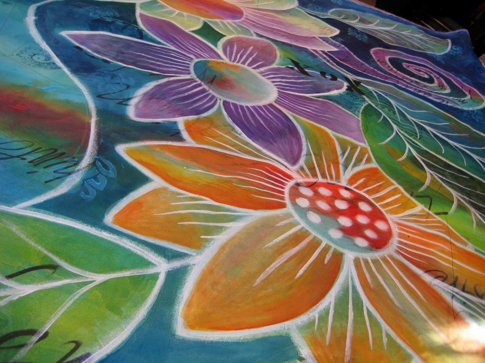
After painting the fabric, I used a permanent marker to write personal words and phrases that expressed some of my feelings. These messages are being written for my own catharsis and ultimately will not be very legible to the viewer. My intention is for the words to be embedded in the work like a talisman.

I also collaged a few bits of printed imagery; a toner printed tea bag and some painted abaca paper that I had leftover from making my One collages.


I also used some of my hand carved stamps with the ink and it worked great, not as thick and gloppy as stamping with regular acrylics.


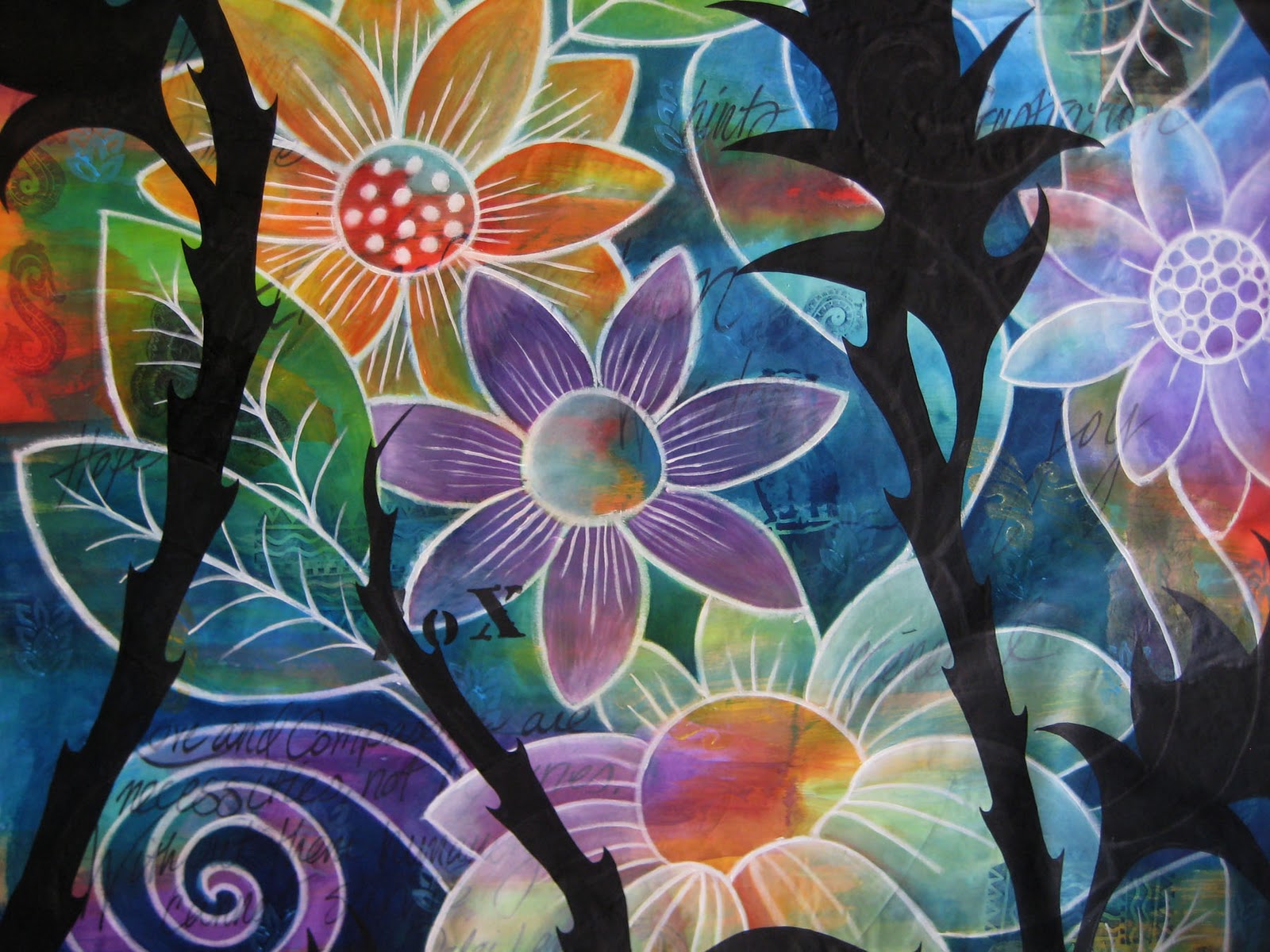
My next step was to draw/paint some big floral imagery. To draw the flower motifs, I thought I would try this solid stick permanent marker I ordered from Dharma.


It was kind of a creamy consistency, much like an oil pastel. It had a little bit of odor but as it dried (after a couple hours) the smell went away. It was easy to draw on the fabric and quickly work out a design. I used the whole stick to draw the images on the quilt, it was easy and convenient but did not go very far.


I am not sure it was better than using a paint brush and paint, but it was probably faster. If you are more comfortable drawing than painting a design freehand then I would recommend it.

To define the flowers from the background it was a matter of painting different colors of ink over the separate areas. For example I painted yellow over the blue areas of the leaves and blue over yellows to get an overall green. I painted a deeper blue over the areas that would be background, making it overall blue yet with all kinds of variations in hue because the colors underneath effect it in different ways.


The large flower was painted over with white, since there was so much green in the under painting it would have been difficult to put a warm color over it without getting a muddy dark flower. As I painted the flowers and background I ended up using white textile paint to add more details and painting over some of the drawn lines to make them bolder.


The next part of the design process involved creating a layer of thorny black weeds to paint on top of the floral imagery.

I took a photo of the painted fabric (by putting it on the floor and standing on a table) and printed out a copy on 8 1/2" x 11" paper. I placed tracing paper over the top and drew multiple versions of weeds until I had it the way I wanted and made a final clean copy with black marker.


My next problem was to figure out how to transfer my design to the painted fabric. I decided the best way to do it would be to project the image on to the cloth. Not having an overhead projector, I decided to use my digital projector that I use for giving lectures.

I scanned the tracing paper and opened the jpg in photosshop, connected my laptop to the projector, taped my painted cloth to the wall and lined up the projected line drawing over the painting. I used a fine point sharpie to trace the line drawing onto my painting.


I painted the weeds with black textile paint, since I wanted it to have the most opacity and I knew it would be tough to cover the white lines.


So now you see where I am, one year after the Three of Swords quilt. There has been some difficult and ugly stuff (represented by thorny weeds) that I have had to deal with, but in the space between there has been a lot of growth, blossoming, renewal, light and life. Even the black bitterness has it's own beauty, it's just a little hard to see sometimes :-) So in other words, I am good! and life is certainly interesting, lol.

As I get further along in the process, I will post about the quilting.

Sunday, January 09, 2011

Online Color Theory class starts February 1

I am happy to announce the new and improved online Color Theory class starting February 1.

9 week online course $60
next class begins February 1, 2011


Did you know the color choices you make can transform an average piece of artwork into something spectacular? Be surprised and delighted by the effects and illusions you can create by understanding the mysteries of color. In this hands-on experiential class you'll learn key color concepts with visual examples, mix new paint colors, and create
helpful charts, all providing you with the tools you’ll need to see color in a whole new light.

Click here to see the Supply List


As part of the class you will start a color journal and learn to mix color using textile paints, creating charts to address the different color theory principles.

Lessons include:
The color wheel
Color Schemes
Tints, Shades and Tones
Value Color Studies
Complimentary Color
Transparency

The class website is designed for students to work at their own pace with each lesson accessible at any time. The lessons include color diagrams and examples with explanations of the different principles for working with color. After each lesson you will blend colors and paint swatches of color to make a chart to fully understand each weeks lesson.


Thursday, January 06, 2011

One Cause, One Wednesday, One Hundred Collages

Virginia Spiegal is lending her fund raising expertise once again to the American Cancer Society with a one day mixed media fiber art auction on Wednesday February 16th.

I am donating two 5" x 7" collages to the auction

Bluebird

Garden Visitors


The goal – Raise $8,000 for the American Cancer Society in just one day. More details and a preview of artwork. Fiberart For A Cause has already donated over $205,000 to the American Cancer Society through the generosity of fiber artists and their patrons.

Tuesday, January 04, 2011

You have got to try these!


I bought a couple bottles of these acrylic inks by Daler Rowney last summer but had not opened them until I got a note from blog reader Stacy Hortner, who mentioned how much she liked them. So I ran out to Blick and bought a few more colors to do a little experimenting.


Working on a piece of cotton sheeting, I randomly painted brush strokes on the fabric and was amazed that the ink did not bleed no matter how much water I added to it. The colors are saturated and vibrant straight out of the bottle.


It would be so easy to create the look of watercolors with these. I love that the brush stroke keeps its definition even when it is diluted with a lot of water. I painted the yellow brush strokes on the flower above and added red at the base. The red bled where the fabric was wet (on the yellow) and did not bleed outside onto the white fabric!


While shading this sphere, I kept adding darker greens making the fabric very wet, when it dried, it had beautiful mottled texture with just the tiniest amount of bleeding on the side where I added the most ink.


I kept adding water to the ink to see how light the color would get before bleeding on the fabric, it didn't! You can still see the brush strokes on the right side, as though it were painted on paper.

Ok, now here's one of the best parts, it doesn't make the fabric stiff! When the inks are painted full strength (and layered up), the fabric is no stiffer than when fabric has been painted with transparent based textile paints, which I have mentioned before leaves your fabric with the best hand of all the different types of textile paint.

Even though this is acrylic, the dry ink color did pick up a little on my pallet when it got wet, so I would recommend heat setting with a hot iron. And if you are someone who washes your work you might want to do a test before using this on something that you might intend to wash.


I love the saturated color and painterly look that can be achieved, with out stiffness. All the color on my newest quilt is painted with the FW inks and white and black textile paint. If you like metallics, the inks also come in pearlescents.

Sunday, January 02, 2011

Happy New Year!


Well, I am back from my blogcation. I realize, I am not so good about creating real down time, it feels like there is always something that needs to be done. So I tend to keep plodding along with out taking time to fully recharge my batteries. I took a little time off from the blog for family time and to start working on a new art quilt. The photo above is a little detail of work in progress, it still has a ways to go with the painting, I'll share more soon.

I am also reworking my online Color Theory class. I have used Google groups as a website for the class the last few years, but Google has changed their site functions and I am afraid it will no longer work well for the class, so I am building a new website myself. Another learning curve there, but I am working on it and so far, so good. Hopefully, I will have things finished up in a couple weeks and will announce the next class after doing a test run.

LinkWithin

Related Posts with Thumbnails